Top 5 reasons to invest in responsive web designing

Responsive web design is the approach of providing the optimal user experience across a wide range of devices from desktop computers to mobile phones by minimising activities of altering, swinging and scrolling.
Simply the fact behind this trend is that the responses of the viewers depend upon the screen size. Therefore, orientation via responsive website designs viewers’ response will be favourable. At the web designing point web designers should adjust the navigation, image text and other elements responsive to any device.
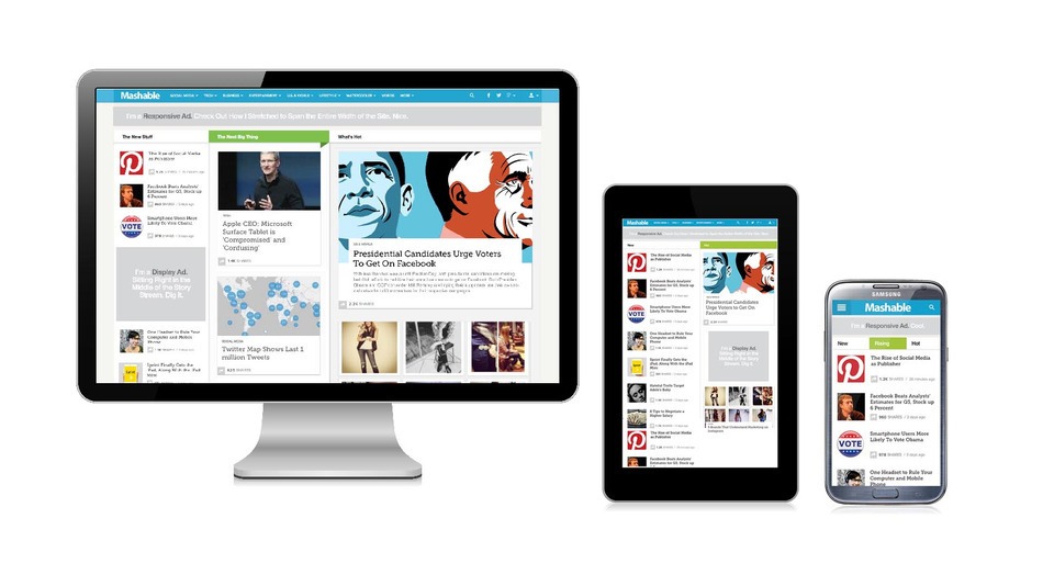
Mashable, is one of the most popular social media blogs has chosen responsive website design for them to provide an optimal viewing experience.
Significance of having responsive web designs
Web designers managed to use one attractive look and feel website design before smart phones and tablets started to be heavily used by people. Earlier a challenge for them was to get traffic to the site. However, after mobile phones and tablets came to the scene web designers had to think of creating desktop friendly sites and mobile friendly sites as well. Instead of developing and maintaining different versions of the websites, designers develop flexible sites that can adapt to different screens.
This article provides you top 5 reasons why you must invest your money in designing responsive websites for your business.

-
Enhanced user experience
If a website is responsive, people do not have to change the screen settings, scroll down to see the rest and to stretch the screens. Responsive designs need not redirect into the central site to enhance the experience. The viewing experience to each and every one is completely enhanced, and it gives a better look and feel to the overall site. As the responsive designs have the standardised style sheets across all the devices, they reduce the barriers like functionality and performance.
-
Single website with a single link
Consistent look and feel from the website is delivered to all users, as the responsive websites are flexible to each and every screen in any device. It is very easy to maintain a single site for the business, client or any party instead of maintaining different website versions. It cuts the cost of improving different site versions that can respond to different screens of different devices. It even provides easy access to Content Manager to update the content into a single website, and one content management system can be applied.

-
Higher rank in search engine results page
As it saves time and costs on duplicating the website versions, it makes more resources available to engage heavily in search engine optimisation. In addition, the website optimisers can make their SEO effort successful by focusing on a single link. Responsive websites do not miss the reach from the mobile and tablet users, as the site is flexible to adapt to any screen size. The possibility of climbing to a higher position in the search engine results page increases with the consolidated SEO and consolidated social media coverage.

-
Reduced resources and increased conversion rates
With the unified strategy of the website with the single linked site, it reduces the required resources. The website development and maintenance needs less work with no duplicated activities and it saves costs and other resources. As the website has one site, it makes it easier to maintain the content and optimise the offline SEO activities. Conversion rates are increasing in a rapid rate due to the increased visibility in the search engine results page and enhances viewer’s experience.
-
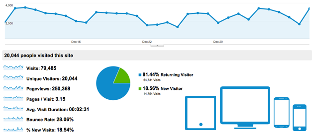
Consolidated analytics reports
Since the responsive website has no multiple pages to maintain, they do not need to track multiple versions. Consolidated analytic reports provide all the monitoring figures, and it is easy to make decisions on the website modifications and improvements. As the single responsive website needs a single paid campaign and social media campaigns lead to the need of single monitoring for almost all the devices, as the orientation in each screen is identical.
According to the latest trending on internet usage patterns, people are moving from desktop computers to tablets and smart phones. Responsive web designs are flexible and adapt with any screen by moving the sites, reallocating the content and resizing the fonts and images. It does not matter what devices your viewers are using; it adjusts to any screen. Finally, in conclusion, we can say that responsive web designs have changed the dynamic competition of the web designing industry by becoming the benchmark of business websites.


