Web Design: What to expect in 2017
A lot of exciting trends are awaiting us in the world of web design at the brink of welcoming the year 2017.
Trends are widely known changes that take place in all creative fields, and web design is no different. Trends are born out of experimentation and innovation, and they always push an industry for improvement.
Responsive websites, flat or semi-flat design, use of bright colors and bolder texts, storytelling and use of beautiful still imagery were among the top trends we witnessed in the year 2016. It’s that time of the year we take a look at top-of-the-line trends that are predicted to emerge from 2017 and beyond.
Decline of stock imagery
Sophisticated users and customers of today seek authenticity from the brands they use and associate with. Static images of businessmen smiling or stock pictures of creatives sat around on a screen just won’t just cut it anymore.
Website designers are ever so challenged to create engaging websites that strike a connection with their audiences. They are demanded to produce bespoke visuals that represent the who they really are, displaying the distinctive uniqueness of a brand.
Rise of illustrations and typography
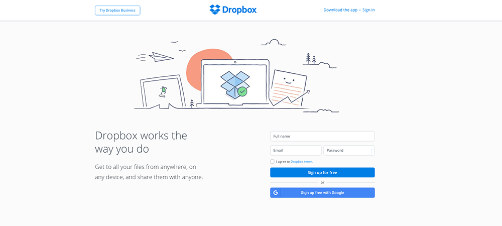
Custom-made hand crafted illustrations are predicted to be rising up to the occasion, as they provide marvelous and versatile mediums to add an element of fun to websites, to make them more friendly or playful.
Typography is another powerful visual medium to create distinctive personality,evoke emotions and set tone. When the device resolutions become sharper and type becomes easier to read on-screen, brands are predicted to push the limits of typography even further to appeal to their users using flashy and edgy fonts. More and more sites are expected to be using Google Fonts; they keep updating new fonts and most popular ones (such as Open Sans, Roboto which are trending now) are displayed first.
We anticipate to see many brands finding innovative ways to make their unique mark, using illustrations, unique photography and typography on websites to stand out among an increasingly crowded arena of competitors.
Evolution of videos, animations and cinemagraphs

They say a picture tells a thousand words, but these do that tenfold. A moving image on a site instantly grabs users’ attention and entice them, enabling brands to get across their carefully constructed narratives and messages.
Videos, animations and cinemagraphs although by no means new, are long-established and versatile mediums which keep evolving. They are useful for storytelling, marketing and vlogging alike, and has several advantages over traditional photos or images. Where still imagery is flat and motionless, videos and animations are more dynamic, appeal to the senses and hold attention for longer time periods using sound and movement. Although cinemagraphs are static pictures, a single minor movement is visible to grab the viewer's’ attention.
All these motion pictures are quickly taking over the internet, and with the benefits they promise, there is no doubt that there will be brands in 2017 wanting to incorporate them into their websites.
Interactive storytelling

Every business is after finding new ways to engage web visitors and be unique in their approach to communicating.
Storytelling is something more and more brands are working on in hopes to capture their user’s attention. It offers an experience to the user. Each scroll changes the screen content and tells a story that the visitors are drawn into.
Designers are giving users rich, unique experiences through the use of visual storytelling. Doing this through means of a website can be quite a complicated endeavor, but it’s not impossible.
We predict more and more brands looking at implementing storytelling with their websites to enhance users' experience. We can expect to see the use of small hover-states and little touches, to full blown visuals for storytelling.
Faster loading speeds and lazy loading
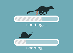
Another trend of 2017 that we anticipate would be more businesses trying to optimise their sites for extremely fast loading times. Google announced a speed limit of 1.5 seconds a couple of years ago. In this short timespan, Google wants a website’s entire loading process to be completed. So the time has come to deal with speed optimization, preparing your website for next year.
Lazy loading feeds a website’s visible area with content bites. The advantage, specially for sites with lots of content, like Facebook or Instagram, is obvious. A large amount of content is not loaded all at once but is only loaded after a demand from user. Only when the user scrolls down will the next content be loaded. For the most part, it happens very quickly.
As the website speed is paramount for SEO, we expect a widespread usage of lazy loading in 2017 by sites with large amounts of content.
Innovative scrolling
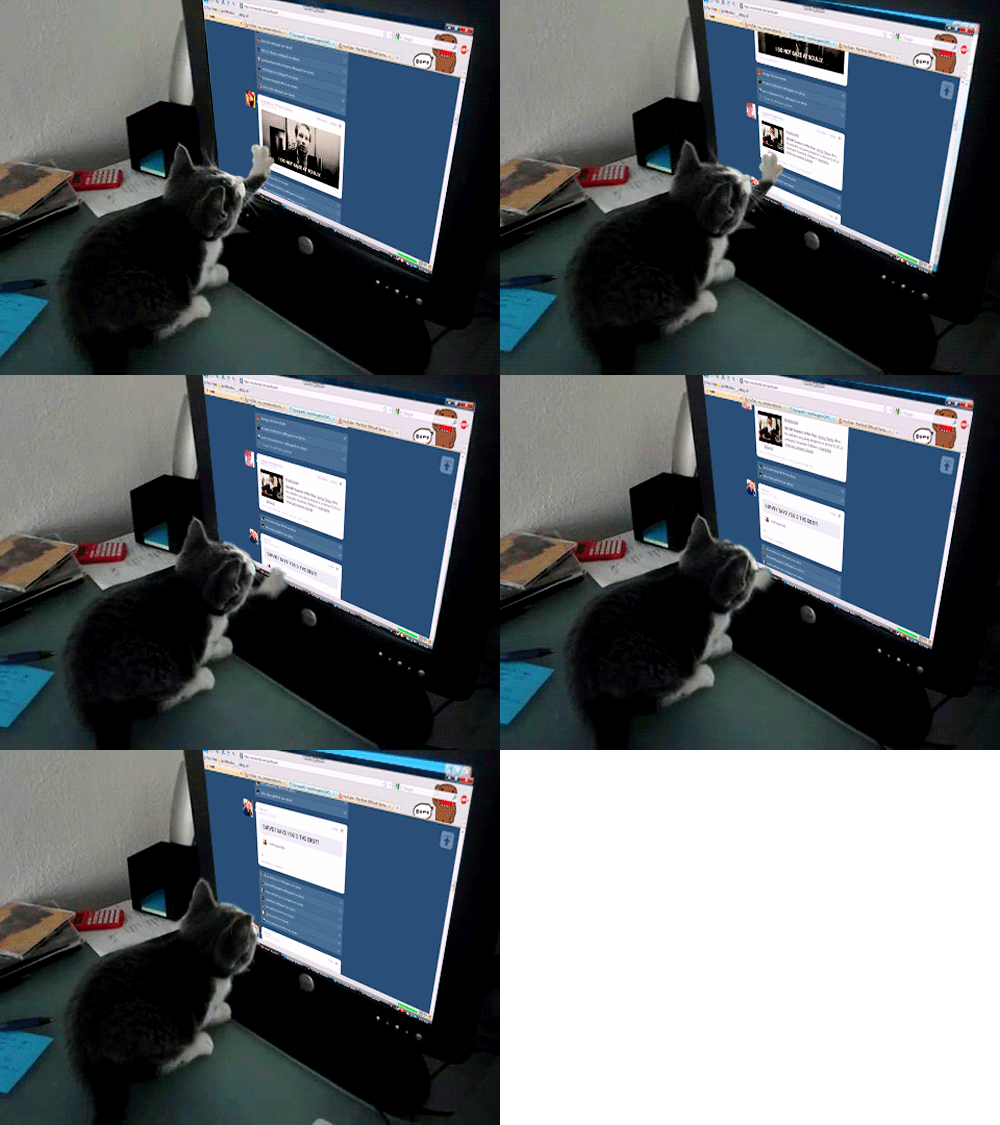
Scrolling, once reserved for getting from top of a page to the bottom, is being used in more creative capacities to deliver content online.
Designers in the past were concerned about keeping the most important content ‘above-the-fold’. We’re noticing this old-fashioned notion disappear, as ‘the fold’ is now harder to define, as users are viewing content from screens of all different sizes and resolutions.
Scrolling is a versatile mechanism when executed well, that can work great with all varieties of content delivery. It works with video-based content, where large full screen videos play and pause as the user scrolls, as well as static or moving content, which can animate, move, or change depending on the user’s input.
Ascent of unique UI patterns and framework
We’re beginning to notice more and more of both UI and UX patterns emerging across the web where many sites look and function in very similar ways as they learn from one another, to refine their user experiences.
We aren’t saying that all sites on the web are beginning to look the same. However, a careful observation can spot some consistent UI and UX patterns such as haptic feedback (When you press a key on a virtual keyboard, it sends out the tactile feedback to the system), user on-boarding ( When a user visits a website, he or she should see an opening introduction about the product or the services) are picking up and they will lead the web to make it more consistent and user-friendly place to be.
As these UI and UX patterns evolve and develop, we’ll see more and more brands implementing them as we move one step closer to a more unified and consistent online browsing experience.
As designers and clever-thinkers across the world learn and borrow ideas from one another, similar patterns emerge and they turn into trends. All of the trends we have discussed above may not be relevant to your brand or content. Yet it is always good to know what’s happening in the industry and see how you can improve your web experience to make progress and obtain a distinctive edge.
Created: November 25th, 2016.


